9th October 2018 by James

Design in itself is a pretty subjective matter meaning there’s a fair few opinions on the best (and worst) ways to go about it, but whatever the opinion, effective design is crucial to the success of any website. Anyone who’s anyone in the world of business has their own site and making it not only look good, but work well, is pretty high on everyone’s agenda.
The impact of colour, image and navigation on website visitors is a powerful part of web design, often speaking words before written content has the chance to. But good web design is not always necessarily about aesthetics, understanding what works for the end user is one of the biggest tasks facing most web designers.
Here are our top web design tips with the user in mind, whether you’re a fully fledged designer yourself or on the lookout to hire a
web design agency, you might just find something to get you thinking.
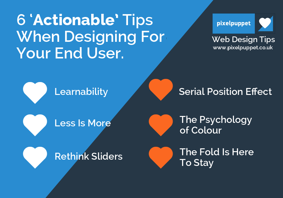
1. Learnability
A term that’s thrown around a lot in the world of web design is learnability; the process of building a website that is easy for visitors to pick up or ‘learn’ and maybe even more importantly, keep them coming back. At the centre of this idea is user-experience; using common page elements, some of which (we’re thinking navigation, logo and main content area) remain in the same place over time to help guide a visitor through the inner workings of your site. Often something that is considered with a more interactive site, learnability can include hoverable ‘tool-tips’ as seen with Twitter to help engage users with all of the exciting functions your site has to offer.
2. Less Is More
There has been a lot of evidence to suggest that overly complex website designs can be damaging to user experience, one study by
Google suggests that the more you try to cram onto a site, the less ‘beautiful’ it is conceived to be and therefore the less time you’re likely to spend on it. Not really the aim you’re going for.
Here are a couple of ideas to use simplicity in web design to make users happy:
- Ditch the sidebar. More people are now opting for a single-column design instead of the more traditional sidebar we all knew and loved. Main reason being, it reduces distraction and focuses attention towards content.
- Familiarity is key. Although non-standard site designs are exciting, as humans we tend to like the familiar which means sticking to the more well known layouts. That said, it doesn’t mean to say you can’t use design to stand out in different ways!
3. Rethink Sliders
Despite the apparent popularity, there is evidence to suggest that the interactive carousels, sliders and accordions built to show off multiple offerings at once, might not be the effective web design solution it was once thought. One study found that the
first image receives 90% of the clicks whilst the remainder receive next to nothing. When it comes to websites, visitors attention spans are limited at best and with so much distraction flying around the online realm, users tend to
scan content, meaning the chances of investing time clicking through a carousel or slider is (unfortunately) pretty slim.
Scrolling could be the answer. Its now thought that web designers should incorporate a scrolling design in favour of clicking through content. It could see you achieve a 30% increase in conversions, certainly not something to be ignored!
4. Serial Position Effect
On the subject of our apparently dwindling attention span, when it comes to online activity, the
serial position effect and its impact within web design is worth noting. Whilst it might sound like a long-winded theory, it essentially states that when given a list (any list will do) we are more likely to remember the beginning and the end, the middle section seems to go amiss. When applying this to web design, it is worth thinking about placing the most popular or profitable products and services at the top and bottom of a list if you want people to notice them.
5. The Psychology of Colour
A lot of what effective marketing and in turn web design comes down to is psychology, understanding how to best appeal to the inner workings of the human brain and it’s most innate desires. There have been a number of studies to suggest that colours have a profound impact on our behaviours and in turn, our impressions of products. One study suggests that up to
90% of our initial judgements on a product can be based on colour alone, if your website designer gets them right, your site could be doing more work for you than you thought.
6. The Fold Is Here To Stay
With so many screen sizes around at the moment, there is some debate around the importance of the fold, however in a 2018 study it was found that visitors spend
57% of their time here, so it would seem it is still absolutely crucial designers get it right. Here’s how: hire a good
SEO copywriter to provide clear and descriptive headlines to grab attention, ensure your designer includes your primary CTA (call to action) and lastly have some fantastically designed images and other visual content.
Here at Pixel Puppet we only list UK based businesses, so it shouldn’t be too hard to find someone local that you can trust. If you’re looking for a web designer or web design agency, finding someone nearby can make it easier to meet them face to face and review their portfolio. If you are a web designer based in the UK and looking to attract the right customers, then why not
add your business to Pixel Puppet. We personally review all registrations to ensure the quality of your business, so that our readers have the confidence to know that your listing is accurate.
